01. Brief / Overview
With a sprint length of 4 days, the goal was to analyze an already existing and highly adopted app and incorporate a new feature into it. There is no surprise my app of choice was Starbucks Coffee not just because of my love of pumpkin spice latte but also because of its user centricity and sophistication in creativity. Coming from a graphic design background, I have always been fascinated with the evolution of a brand and creating something bigger than just selling a product or service.
02. Business Analysis
Performing a competitor feature analysis revealed that Starbucks is currently limiting their users’ ability of scheduling future orders and letting them only access locations near them. This data helped me to arrange the market positioning chart where I was able to identify the placement of Starbucks to a new blue ocean market.
03. User Research
Diving into research, I conducted 6 one-on-one guerilla style interviews focusing on current platform users’ frustrations which they experience while using the app. As a result, I was able to gather great insight into current pains as well as gains.
“It’s frustrating to have a time saving option that doesn’t save you time, I can't really plan out mornings!``

“It's not quick and simple to place my order when I’m on the subway and it can’t pinpoint my current location.”

“This app is great for skipping line, but in a busier store, but does a horrific job at predicting the wait time.``

04. Ideation
The insights and data from user interviews, helped me to ideate using How Might We structure to improve their experience of ordering a drink/food using Starbucks mobile app. Organizing these ideas by crafting a framework for Jobs to Be Done, I was able to pin-point what would bring them the most value.
Main Job Story
When the user places a mobile order, they want to skip the line so that they can save their highly valued time.
New Feature Story
When the user wants to schedule an order, they want to avoid reordering everyday so that they can continue their week without interruption to save their highly valued time.
High-level user flow was developed using the research insights and findings from the initial research and discovery phase. I decided to keep the usability focused on the scheduling portion to enable users to place a future order. It allowed me to visualize the structure of what an experience would need to provide to satisfy user needs.

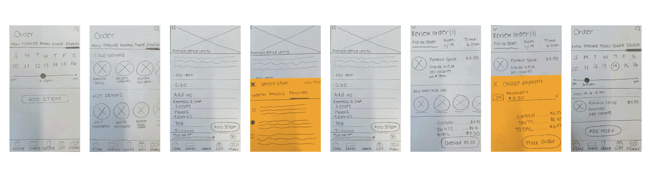
Based on the different stages outlined in the user flow, wireframes and paper prototypes were created, then tested with 15 users in order to determine which of the high-level approaches were the most functional, easy to understand, and impactful to potential users. The process was repeated through multiple design interactions to quickly validate or eliminate design approaches.
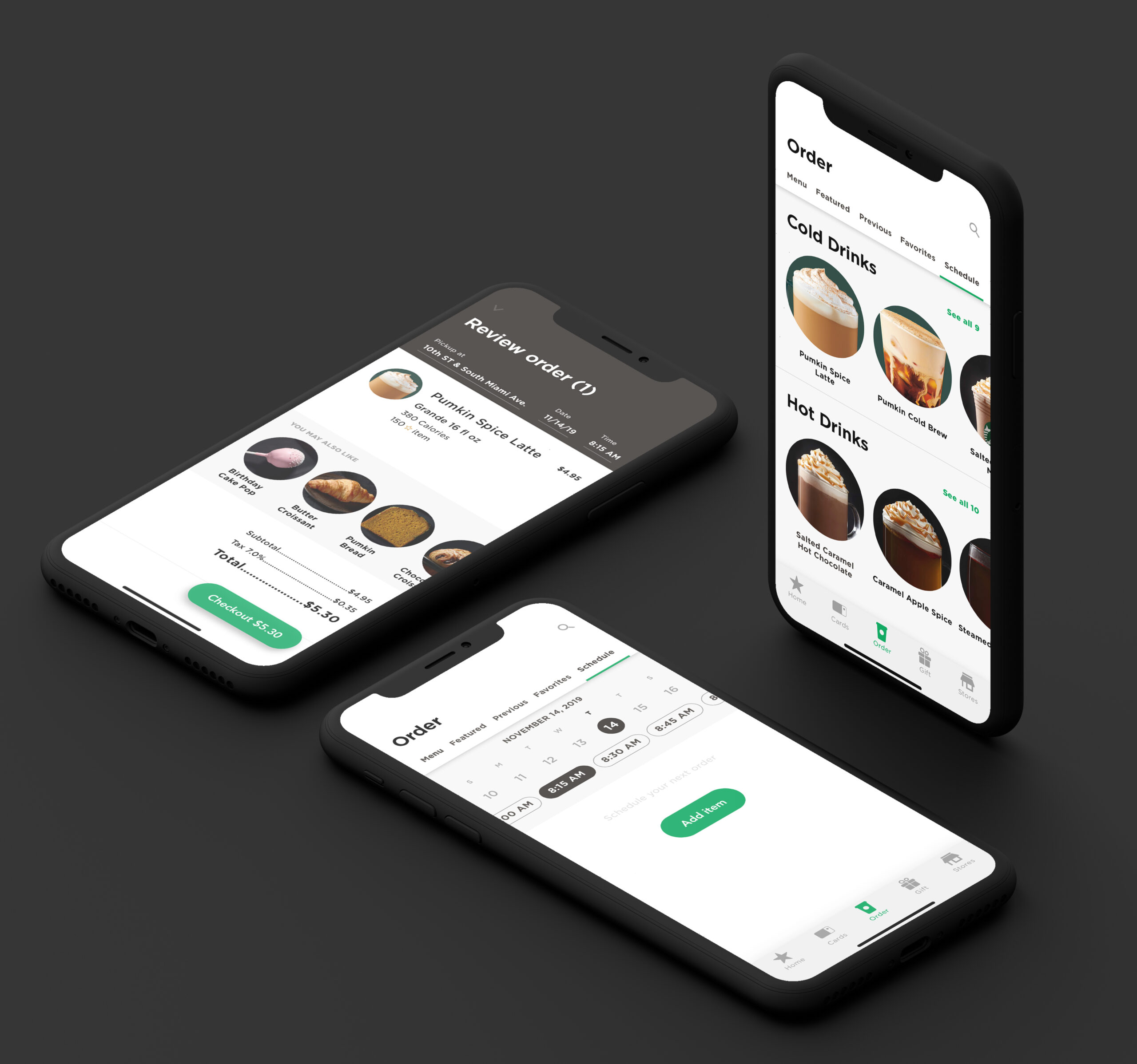
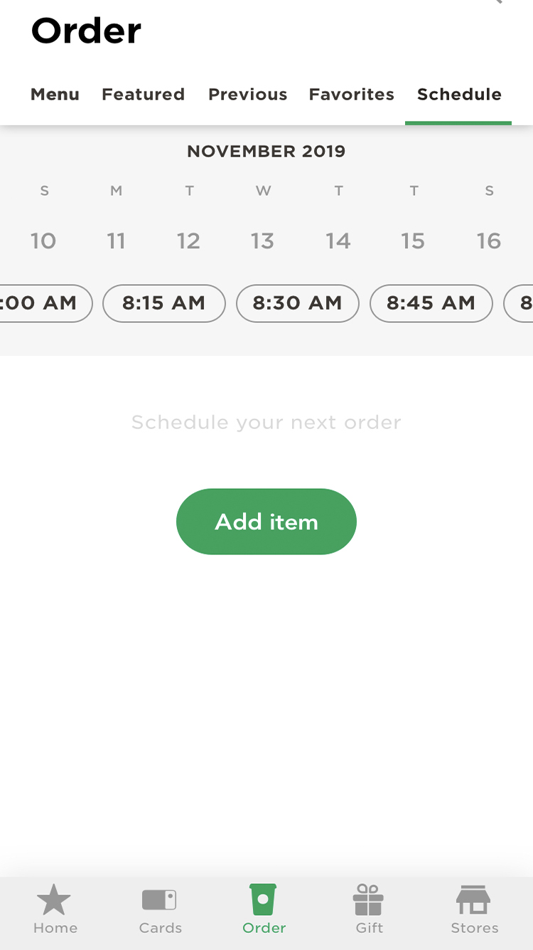
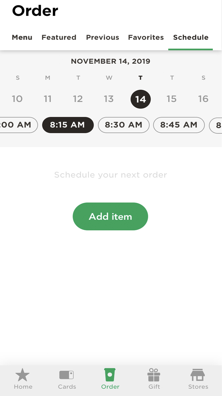
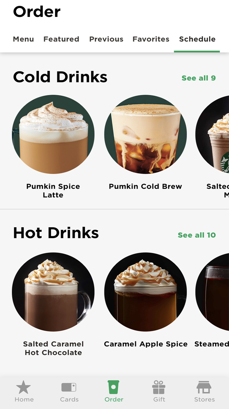
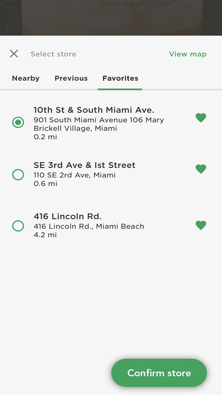
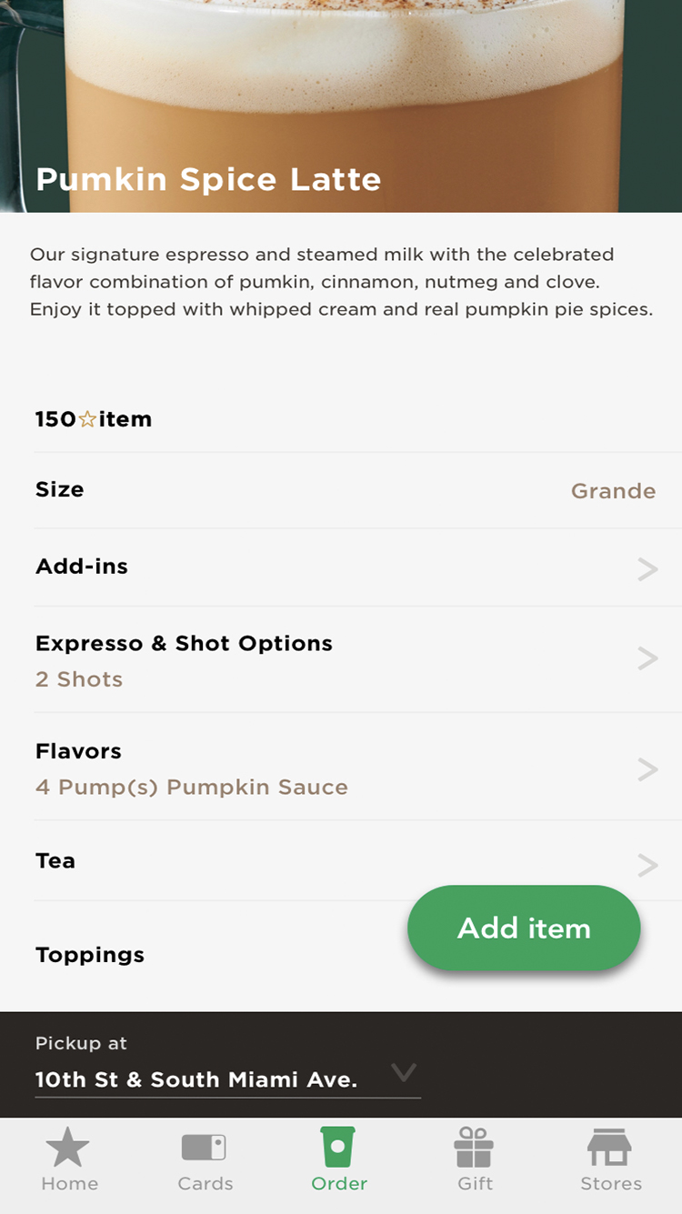
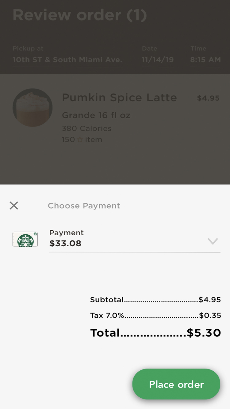
05. Mobile App Experience
To integrate the look and feel of the Starbucks brand with the use of atomic design inventory a set of visual styles for the core components for the interface was developed. In addition to picking up the core styles of the existing app, several components and styles were created that were unique to the scheduling feature. The prototype demonstrates a user placing an order, a week ahead, to be picked up at their favorite location.


06. Key Learnings & Next Steps
Going through this initial exercise, I was quite surprised to find so many opportunities for improvement for the Starbucks app that proved that even very profitable and successful companies need to evolve and change over time to remain competitive.